2025-03-31
Data range, Chart, report
The following explains how charts work and what data they display.
- The data displayed on the charts is determined by two factors:
- The date range (Today, Yesterday, Last Month, This Month, etc.).
- The report category on Income. (Figure 1)
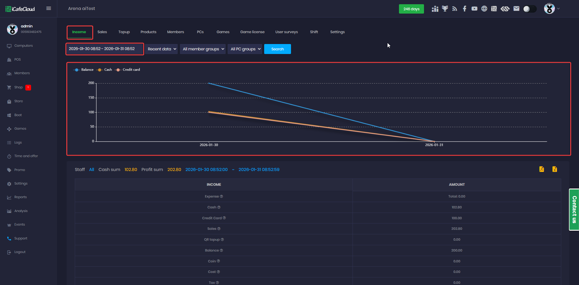
Figure 1
- This chart provides a visual representation of Income from Balance, Cash, and Credit Card amounts, showcasing earnings based on the selected time duration.
- The blue chart represents the Balance amount
- The orange chart reflects the Cash amount
- The pink chart shows the Credit Card amount.
- You can enable or disable each data set to show by clicking on the corresponding color dot.(Figure 2)

Figure 2
- If you select just one day to view the chart, the time range will adjust to display hours instead of days. (Figure 3)
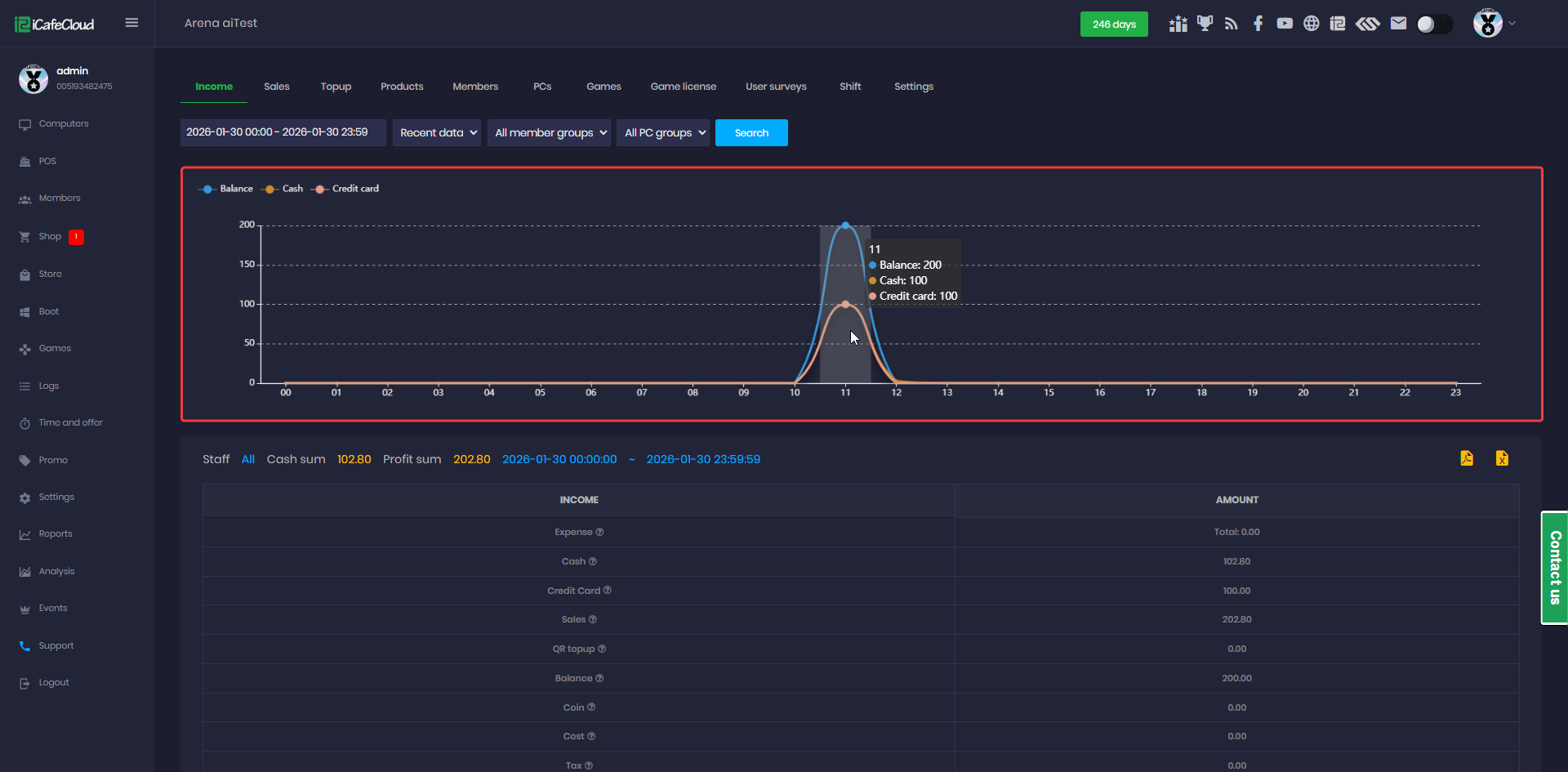
Figure 3
- Each report page has different range options:
- Income: Balance, Cash, Credit Card
- Product: Product, Offer, Cash, By Balance, Credit Card, Coin (Figure 4)
- Top-up: Member, Guest, Prepaid, Postpaid, Cash, Credit Card, Bonus (Figure 5)
- Product: All products from inventory
- Member: New members created
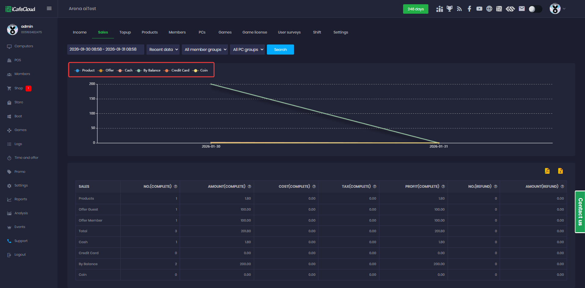
Figure 4
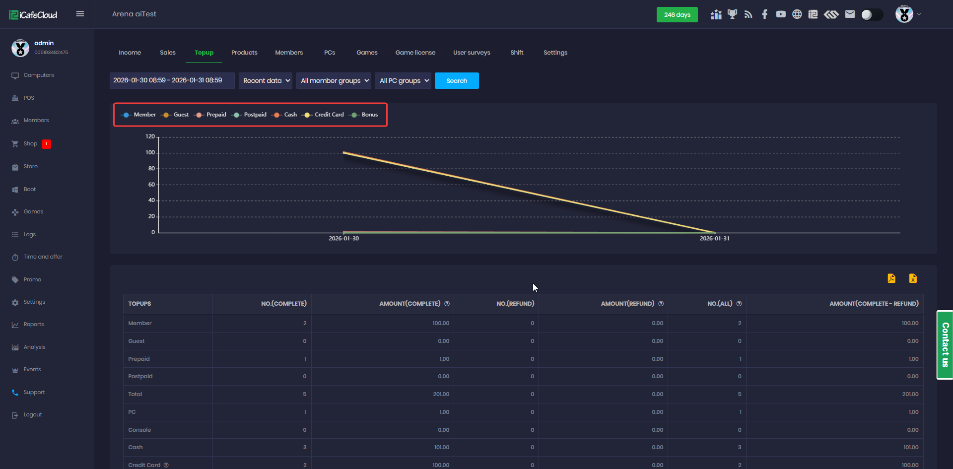
Figure 5
- Products: shows all products sold within the selected date range options. (Figure 6)
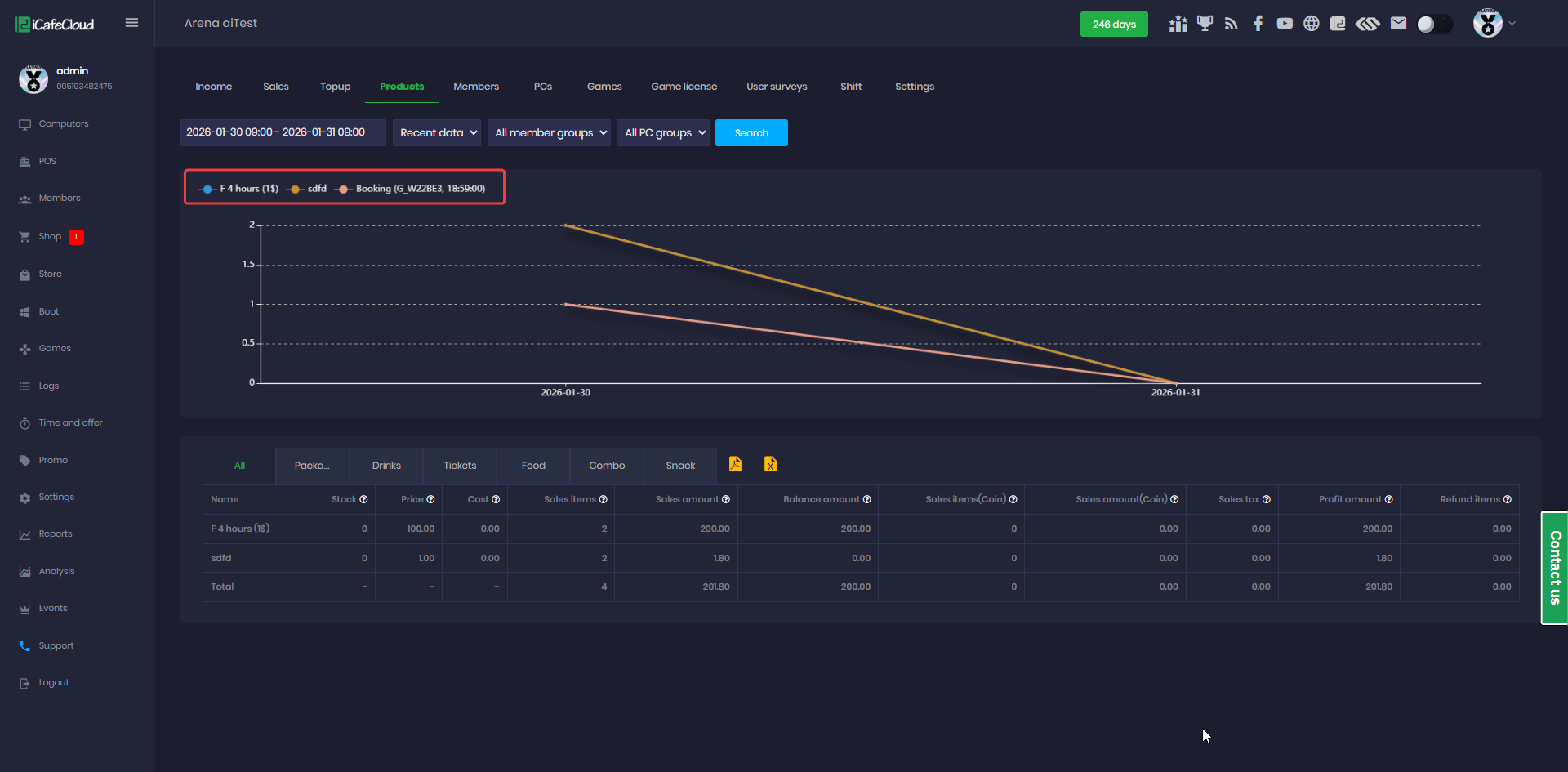
Figure 6
- Members has about New members (Figure 7)
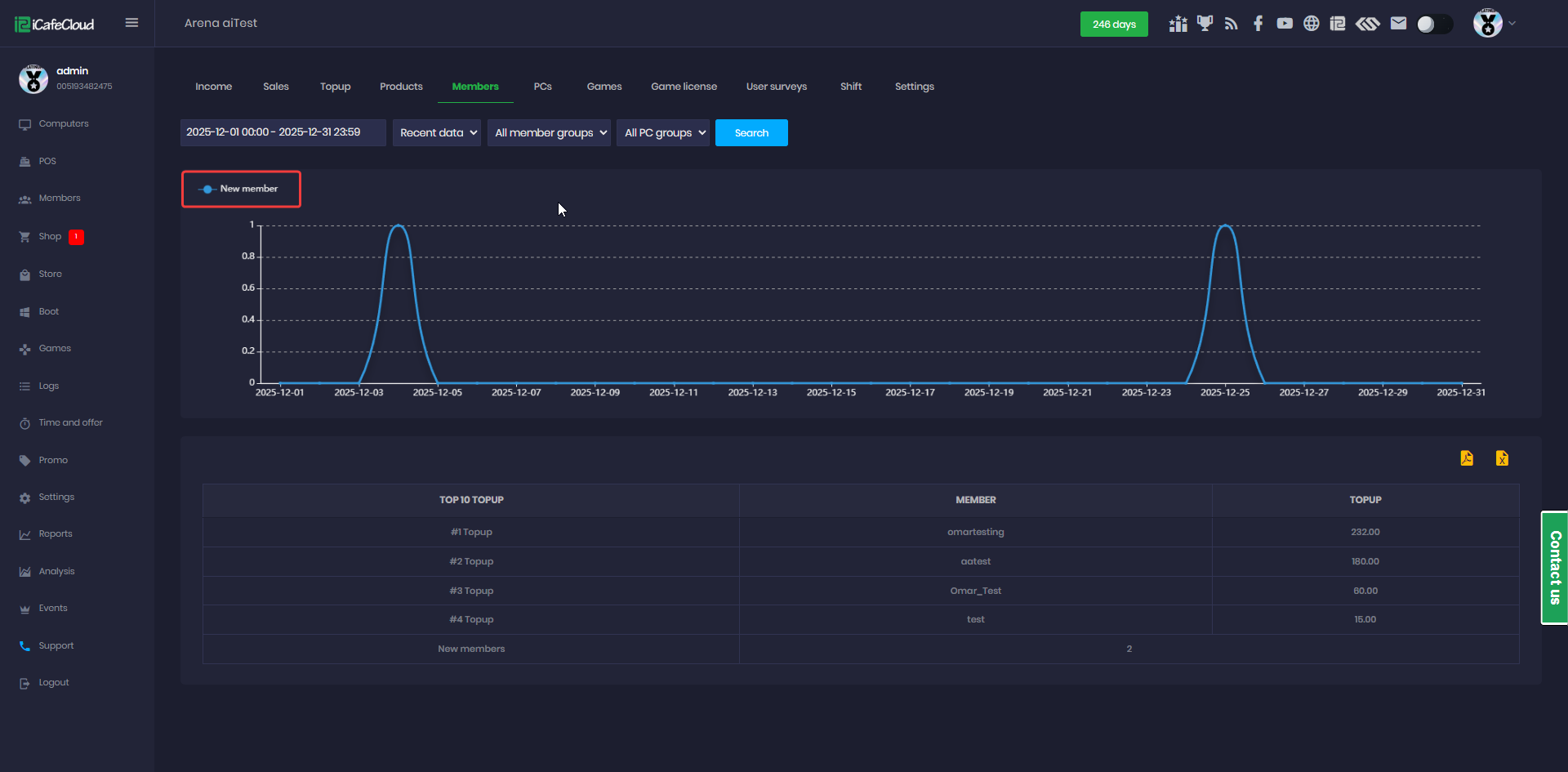
Figure 7
- Games , PCs ,Game license , Surveys and Shift do not have charts.(Figure 8)
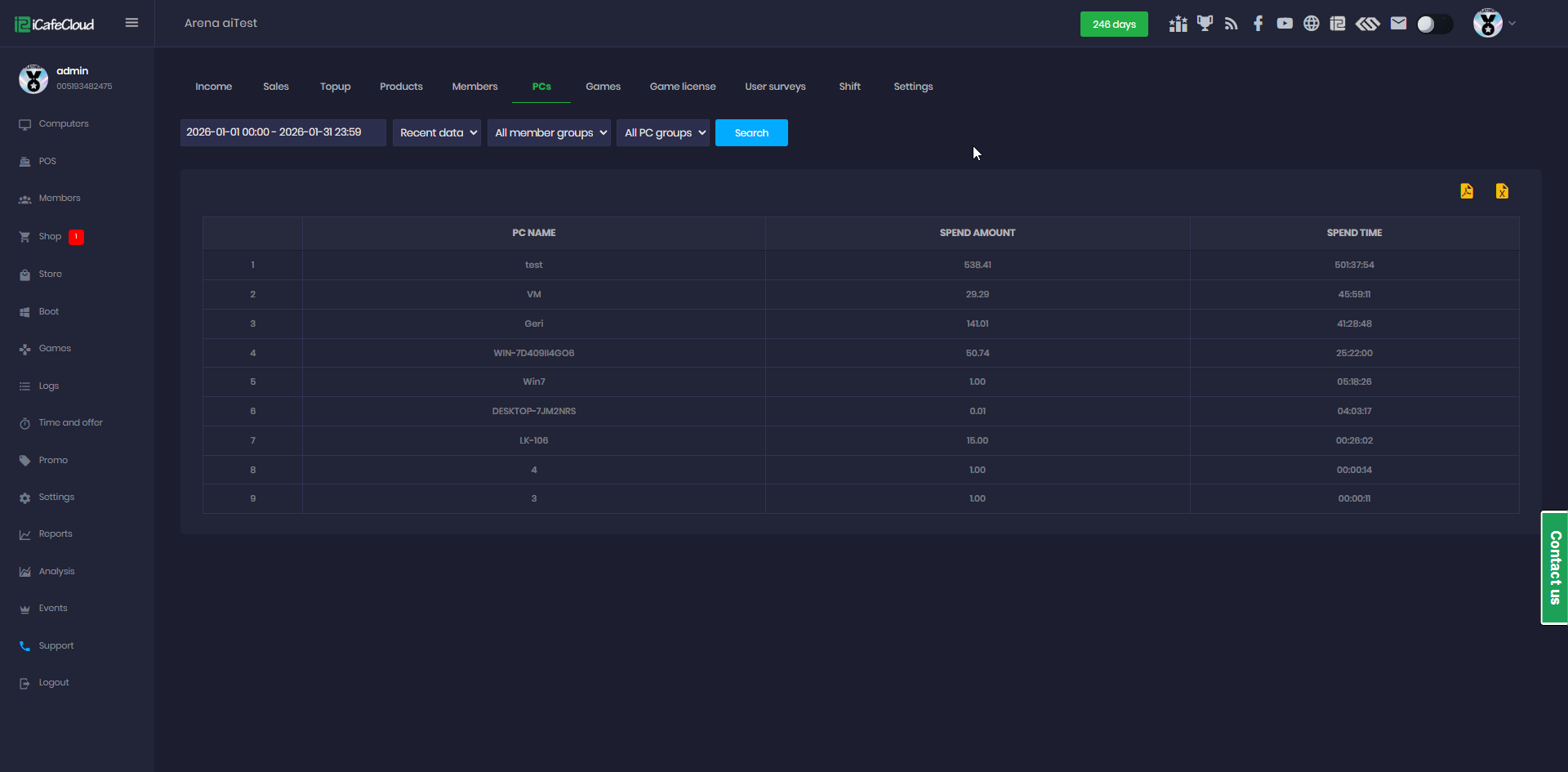
Figure 8